


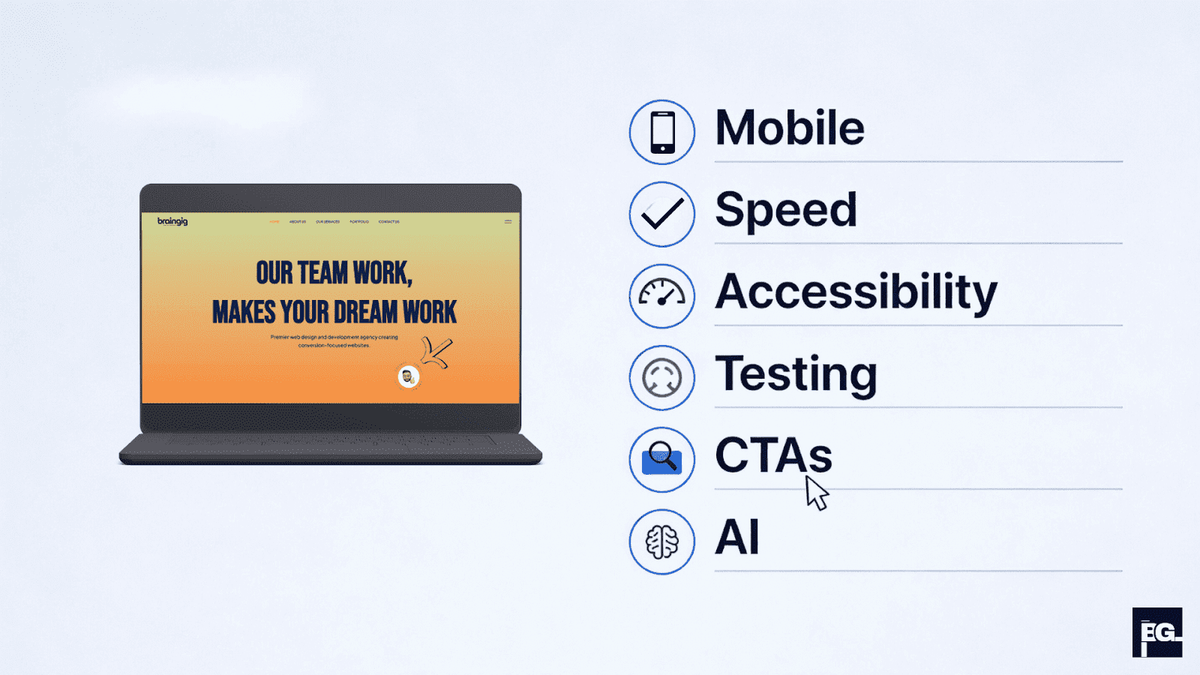
Step 1: Prioritize Mobile-First Design from the Start
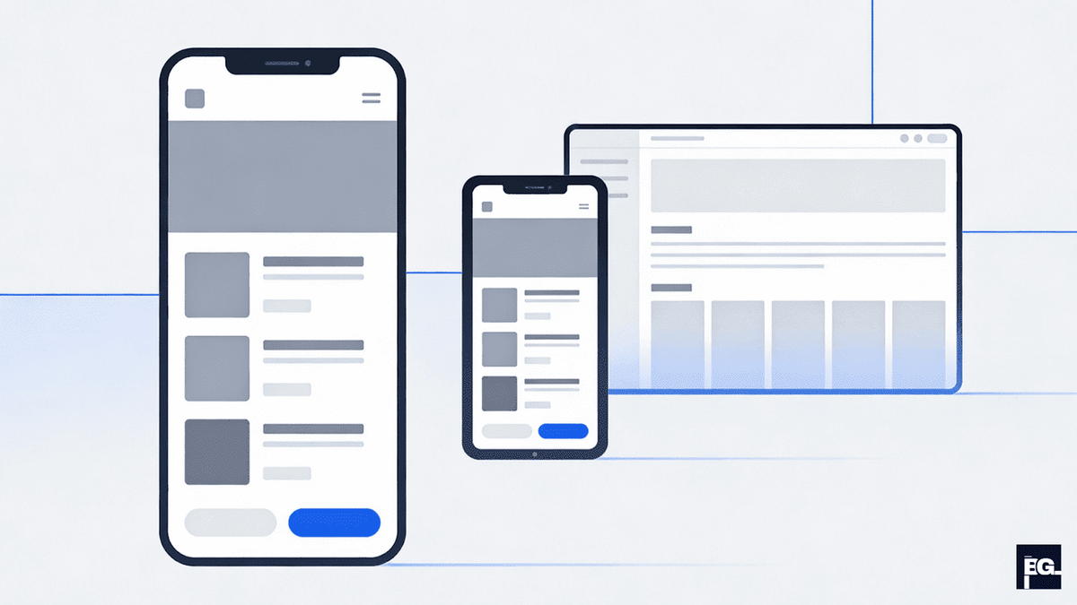
Mobile-first design has evolved from a nice-to-have feature to an essential foundation for modern web development. This approach flips the traditional design process by starting with mobile layouts and progressively enhancing the experience for larger screens.
Why Mobile-First Matters in 2026
Search engines now use mobile-first indexing, meaning they primarily evaluate the mobile version of your site for rankings. More importantly, the majority of web traffic comes from mobile devices, making mobile optimization critical for capturing your audience. Starting with mobile constraints forces you to prioritize essential content and functionality, resulting in cleaner, more focused designs that translate beautifully to desktop.
Implementation Strategy
Begin by designing for the smallest screen first, typically 320-375px width. Focus on core functionality and essential content that users absolutely need. Use progressive enhancement to add features as screen space increases. Key elements include:
- Touch-friendly targets: Ensure buttons and interactive elements are at least 44x44 pixels for easy thumb navigation.
- Simplified navigation: Implement hamburger menus or bottom navigation bars that work naturally on small screens.
- Compressed images: Use responsive images with the modern formats like WebP or AVIF to reduce load times.
- Minimal scrolling: Place critical calls-to-action above the fold where users can access them immediately.
The benefits extend beyond user experience. Mobile-first design improves page speed, reduces bounce rates, enhances accessibility across devices, and future-proofs your site for emerging mobile technologies.
Step 2: Optimize Page Speed and Core Web Vitals
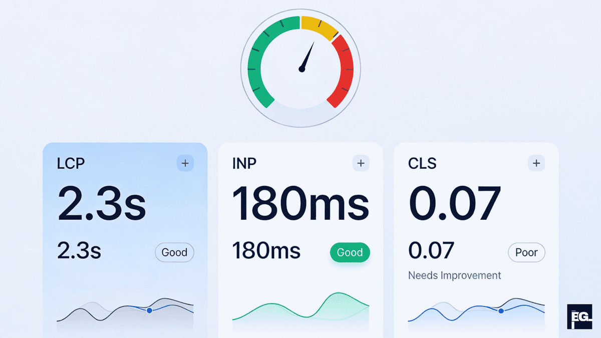
Website performance directly impacts both user satisfaction and search engine rankings. Google's Core Web Vitals have become critical ranking factors, measuring real-world user experience through key metrics.
Understanding Core Web Vitals
Largest Contentful Paint (LCP) measures loading performance and should occur within 2.5 seconds. This metric tracks when the largest content element becomes visible to users. Interaction to Next Paint (INP) measures responsiveness, with good experiences maintaining under 200 milliseconds. Cumulative Layout Shift (CLS) gauges visual stability, aiming for scores below 0.1 to prevent annoying content jumps.
Optimization Techniques
Improve your LCP by compressing and converting images to WebP format, using system fonts optimized for the web, and minifying JavaScript, CSS, and HTML code. Preload critical resources using the <link rel="preload"> tag and add fetchpriority="high" attributes to LCP images. Remove the loading="lazy" attribute from above-the-fold images to prevent delayed loading.
For better INP scores, avoid or break up long JavaScript tasks, remove unnecessary third-party scripts, and reorganize Document Object Model (DOM) reads and writes to prevent layout thrashing. Each third-party script can slow your page by 34 milliseconds on average.
Enhance CLS by setting explicit sizes on all content loaded from the page, using CSS Grid and Flexbox for stable layouts, and avoiding animations that use layout-inducing CSS properties. Consider using a Content Delivery Network (CDN) to deliver content faster globally and implement aggressive caching for static assets.
Step 3: Implement Accessibility-First Design Principles
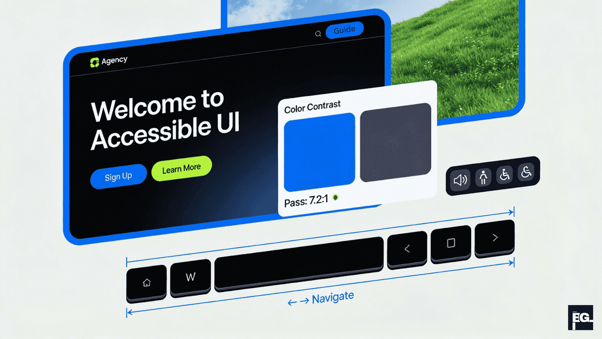
Accessibility has transitioned from optional consideration to legal requirement. By April 2026, state and local government websites must comply with WCAG 2.1 Level AA standards, setting a precedent for all digital properties.
WCAG 2.1 Core Principles
The Web Content Accessibility Guidelines center on four fundamental principles. Content must be Perceivable through one or more senses, Operable via various input methods including keyboard navigation, Understandable with clear language and predictable functionality, and robust enough to work across different technologies and assistive devices.
Practical Accessibility Implementation
Start with color contrast ratios. Text and interactive elements require a minimum contrast ratio of 4.5:1 for normal text and 3:1 for large headings. Use color contrast checkers to verify your palette meets these standards. Never rely on color alone to convey information, always provide additional indicators like icons, patterns, or text labels.
Structure your content using semantic HTML with proper heading hierarchy (H1, H2, H3) to help screen readers navigate. Provide alt text for all meaningful images, implement keyboard navigation for all interactive elements, and include clear focus indicators.
Step 4: Conduct Thorough User Research and Testing
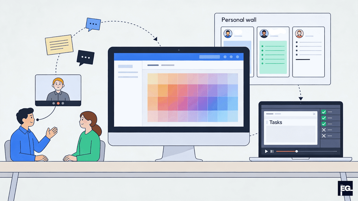
Exceptional user experience begins with deep understanding of your users, their needs, pain points, behaviors, and goals. User research transforms assumptions into actionable insights that guide every design decision.
Essential Research Methods
User interviews provide rich, qualitative insights through one-on-one conversations. Conduct interviews with 5-10 users to uncover first-hand stories, frustrations, and needs. Watch users interact with your site or competitor’s sites to identify usability issues you might miss.
Heatmaps and session recordings reveal exactly where users click, scroll, and linger. Tools like Hotjar visualize user behavior patterns, identifying which elements attract attention and which get ignored. If users repeatedly click non-clickable elements, that signals a need to adjust visual affordances.
Creating User Personas and Journey Maps
Synthesize research findings into user personas, semi-fictional representations of your ideal customers based on real data. Include demographics, goals, pain points, behaviors, and motivations. Strong personas keep teams aligned and focused on user needs throughout the design process.
Map user journeys to understand different paths users take to achieve goals. Document actions, mindsets, and emotions at each journey stage. This reveals friction points and opportunities for improvement.
Best Practices
Conduct user research continuously, not just at project start. Begin testing with rough mockups to catch issues early when changes are easier. Combine qualitative insights from interviews and usability tests with quantitative data from A/B tests and analytics for comprehensive understanding.
Step 5: Create Intuitive Navigation and Information Architecture
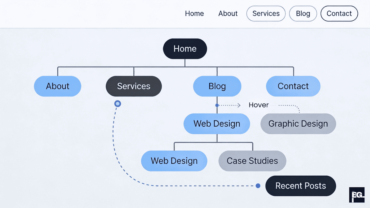
Navigation serves as the roadmap for your website. Well-designed information architecture ensures users find what they need quickly and intuitively, directly impacting engagement, satisfaction, and conversion rates.
Principles of Effective Navigation
Consistency builds user confidence. Place main navigation menus where users expect them, typically at the top or left side of pages. Use recognizable icons like shopping carts for e-commerce sites and ensure navigation elements behave predictably across all pages.
Visual feedback confirms user interactions. Buttons should change color or appearance on hover, indicating they're clickable. Use active states to show users their current location within the site.
Information Architecture Fundamentals
Build a sitemap that visualizes your site's structure in a hierarchical tree format. Sitemaps serve dual purposes: planning website structure and helping search engines crawl and index your content. The eight-step process includes preparing for sitemapping, brainstorming content types, defining primary navigation, establishing secondary and tertiary hierarchy, accounting for utility pages, capturing page specifications, designating page templates, and iterating until complete.
Implementation Strategies
Keep menus simple and focused. Limit primary navigation to 5-7 items to prevent overwhelming users. For sites with extensive content, include a search bar prominently. For mobile experiences, hamburger menus conserve screen space while bottom navigation bars enhance thumb-zone reachability.
Step 6: Leverage Visual Hierarchy and White Space
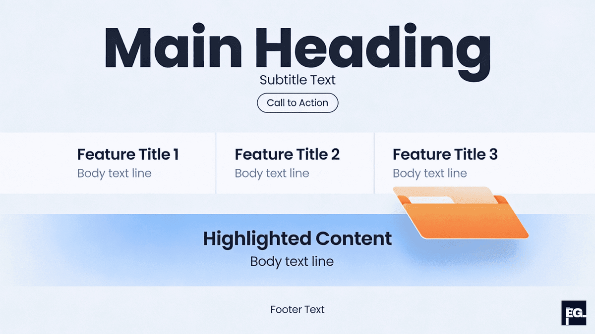
Visual hierarchy and strategic use of white space guide users through content, emphasizing important elements while creating breathing room that improves readability and reduces cognitive load.
Understanding Visual Hierarchy
Visual hierarchy organizes content to show users what to read first and how elements relate to each other. It directs attention through variations in size, color, contrast, spacing, and positioning.
Size and scale establish importance. Larger elements naturally draw attention first, making headlines and primary calls-to-action more prominent. Color and contrast highlight key elements against backgrounds. Typography creates hierarchy through font size, weight, and style-bold headings stand out from regular body text.
The Power of White Space
White space, also called negative space, refers to empty areas around and between design elements. Far from wasted space, it serves critical functions in user experience.
White space improves readability by giving text room to breathe. It directs focus by isolating important elements, making them pop. It creates sophistication through clean, uncluttered layouts that communicate professionalism. It reduces cognitive load by preventing visual overwhelm.
Typography and Readability
Combine visual hierarchy with proper typography. Use legible typefaces with clear, distinctive letter designs. Maintain adequate line height (1.5-1.8 times font size) and comfortable line length (50-75 characters per line). Ensure sufficient color contrast, at least 4.5:1 for body text.
Create typographic hierarchy through font pairing. Use sans-serif fonts for body text and subheadings for easier screen reading. Reserve serif fonts or more decorative typefaces for large headlines. Limit your design to 2-3 font families maximum to maintain cohesion.
Step 7: Design Compelling Calls-to-Action
Calls-to-action (CTAs) guide users toward desired actions, purchases, sign-ups, downloads, or contact. Effective CTA design dramatically impacts conversion rates through strategic application of design principles.
Visual Design Principles
Make CTAs noticeable through size, color, and positioning. Use bright, contrasting colors that stand out from surrounding elements without clashing with your color scheme. Studies show that color psychology influences user behavior, though the most effective color varies by context and brand.
Size matters, buttons should be large enough to draw attention and ensure easy clicking, especially on mobile devices where thumbs are less precise than cursors. However, avoid making buttons so large they appear intimidating or dominate the page.Add visual features like shadows, borders, or hover effects to make buttons appear three-dimensional and interactive.
Microcopy Excellence
CTA text should inspire immediate action. Use active verbs that tell users exactly what happens when they click: "Get," "Download," "Start," "Join," "Claim". Replace vague phrases like "Click Here" or "Submit" with specific, benefit-focused language.
Keep text short, typically 2-5 words. Long text increases cognitive load and dilutes impact. Highlight the benefit users receive: "Access Free Report" works better than "Learn More".
Strategic Placement
Position primary CTAs above the fold so users never miss them. Place buttons where they align naturally with user flow, after explaining benefits, not before. Users read top-to-bottom and left-to-right in Western cultures, making bottom and right positions stronger for CTAs.
Limit CTAs per page to prevent decision paralysis. If multiple options are necessary, emphasize the primary action through size, color, or position. Buffer uses this technique effectively, offering several sign-in options while clearly highlighting the preferred path.
Step 8: Optimize Content Strategy and UX Writing
Words shape user experience as much as visual design. Content strategy and UX writing ensure every piece of text, from headlines to button labels to error messages, guides users effectively while reinforcing brand personality.
Content Strategy Fundamentals
Content strategy focuses on planning, delivery, and maintenance of content across all formats and channels. It addresses what content to create, how to organize it, who creates it, and how to govern quality and consistency.
Effective content strategy aligns with business goals and user needs simultaneously. Start by auditing existing content to identify gaps, redundancies, and outdated material. Research user questions and pain points to understand what information they seek.
UX Writing Best Practices
UX writing creates clear, concise, contextually appropriate copy that guides users through experiences. This includes UI copy (buttons, navigation labels, error messages), microcopy (headlines, tooltips, form instructions), and longer-form content.
Clarity trumps cleverness. Users scan rather than read, so get to the point quickly. Use simple language free from jargon. Break complex information into digestible chunks with descriptive headings and short paragraphs.
Maintain consistent voice and tone throughout your site. Consistency builds trust and professionalism while reinforcing brand personality. Create a voice and tone guide defining how your brand sounds in different situations.
Microcopy That Delights
Microcopy refers to small, informative text on forms, buttons, tooltips, and error messages. Though brief, microcopy profoundly impacts user experience.
Great microcopy prevents confusion by providing clear instructions and feedback. It reduces friction in critical moments like form submissions or checkouts. It reinforces brand personality through distinctive word choices that set you apart from generic competitors.
Follow writing guidelines from your content standards. Ensure every word aligns with brand strategy and passes governance checks for clarity, tone, and compliance. Tools like Acrolinx help teams maintain consistent, high-quality microcopy at scale.
Implementation Tips
Analyze how your users express themselves by hanging out in online communities, reading social media comments, and reviewing customer support transcripts. Mirror user language to ensure your message resonates.
Front-load important information at the beginning of text blocks. Use action-oriented language that motivates users. Provide context explaining why users should take actions.
Test content effectiveness through readability scores, user testing, and A/B testing different copy variations. Small wording changes can significantly impact conversion rates, remember how Asos achieved a 50% CTR increase through revised button text.
Step 9: Implement Design Systems and Component Libraries
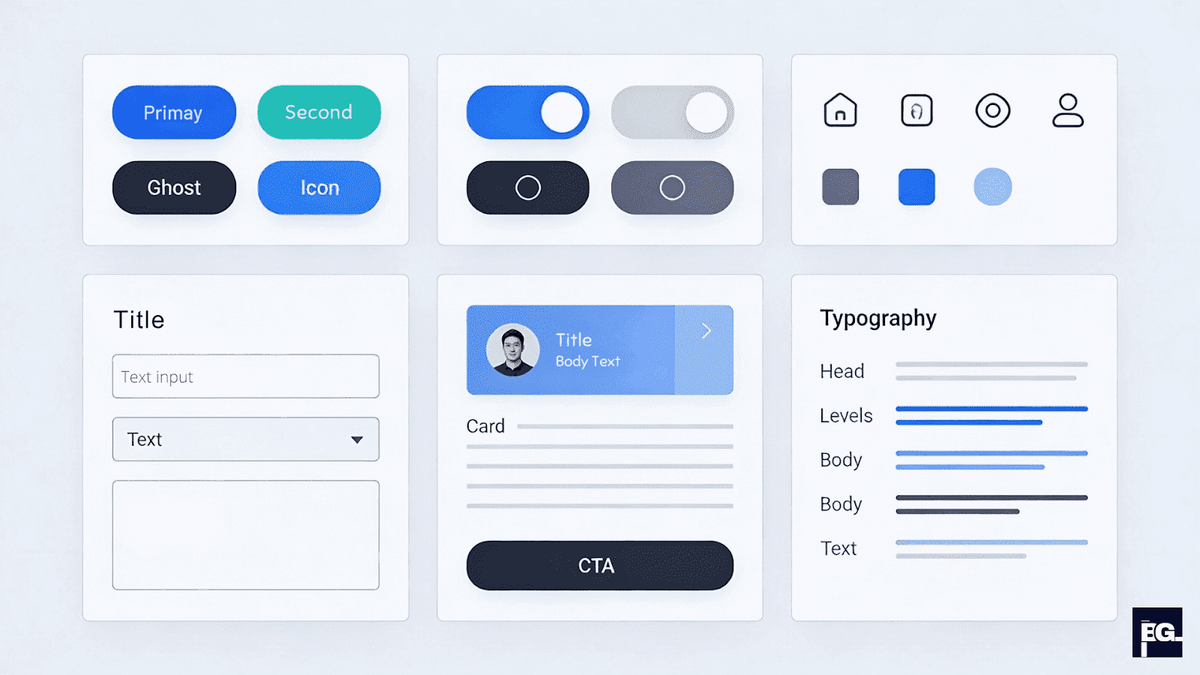
Design systems and component libraries accelerate development while ensuring consistency across digital products. These foundational tools have become essential for teams building scalable, maintainable user experiences.
Understanding Design Systems vs. Component Libraries
A component library serves as a repository of reusable UI elements, buttons, forms, cards, navigation menus, with their code and design specifications. Think of it as a toolbox filled with pre-built, standardized pieces that designers and developers can quickly implement.
Benefits of Component Libraries
Time savings top the list of advantages. Teams build faster by reusing existing components rather than recreating elements from scratch for every project. Atlassian's design system helped their teams accelerate product development significantly through code reuse.
Consistency across products creates cohesive user experiences. When all teams use the same buttons, forms, and navigation patterns, users encounter familiar interfaces regardless of which feature they use. This familiarity reduces learning curves and builds confidence.
Popular Component Libraries and Tools
Material UI offers open-source React components following Google's Material Design principles. Ant Design provides a comprehensive library with enterprise-grade components. For design tools, Figma leads with real-time collaboration, component systems, and dev handoff capabilities. Storybook creates interactive catalogs of UI components for documentation and testing.
Implementation Strategy
Start by identifying common UI patterns used across your products. Document these as reusable components with clear specifications for spacing, colors, typography, and interaction states. Build components in isolation to ensure they're truly reusable by default.
Create variants for different use cases, primary vs. secondary buttons, different card styles, various form layouts. This flexibility prevents teams from creating one-off solutions that bypass the library.
Establish governance processes defining who can add new components, how they're reviewed, and when updates occur. Without governance, component libraries become cluttered with duplicates and inconsistent elements.
Step 10: Continuously Test, Iterate, and Leverage AI Tools
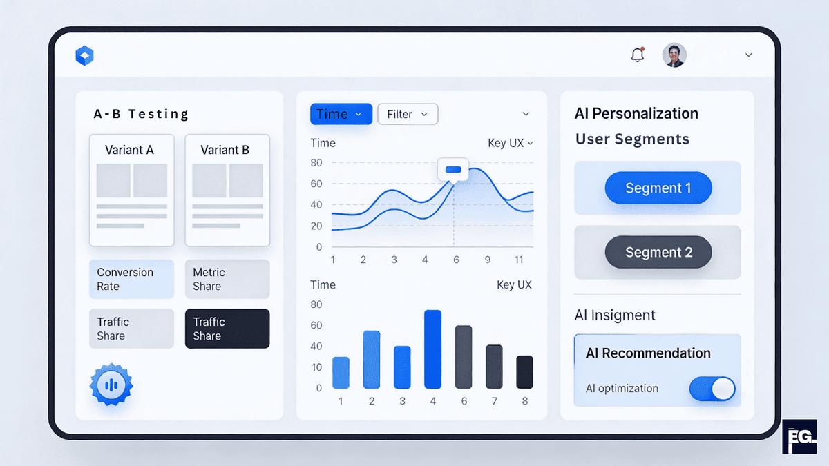
Optimization never ends. The final step involves establishing processes for continuous improvement through testing, iteration, and leveraging emerging AI technologies that are reshaping UX design in 2026.
Establishing a Testing Culture
A/B testing compares two versions of a design element to determine which performs better. Test one variable at a time, headline copy, CTA color, page layout to isolate what drives improvements. Tools like Google Optimize and Optimizely make experimentation accessible.
Run tests long enough to achieve statistical significance, typically reaching several hundred conversions per variant. Account for day-of-week and seasonal variations that might skew results.
Multivariate testing examines multiple variables simultaneously to understand how they interact. While more complex, multivariate tests reveal combinations that work best together.
Gathering Continuous Feedback
Implement multiple feedback collection channels. In-app surveys triggered by specific user actions gather contextual insights. Session recordings show exactly how users interact with your site. Heatmaps reveal attention patterns and clicking behavior.
Customer support tickets highlight recurring issues. NPS surveys measure recommendation likelihood. Feature request tools help prioritize your roadmap based on user demand.
Tools like Lyssna, Hotjar, UserTesting, and Userpilot streamline feedback collection with customizable surveys, session replay, and behavioral analytics.
Leveraging AI in UX Design
AI has become mainstream in UX design, with 93% of designers already using generative AI tools like ChatGPT and Midjourney. The impact extends beyond content generation to fundamentally changing design workflows.
AI as design collaborator tops the list of 2026 trends, with 73% of designers believing it will have the biggest impact. AI assists with layout suggestions based on user behavior data, automates repetitive tasks like creating design variations, and generates interface elements automatically.
AI-powered personalization creates dynamic experiences adapting to individual users in real-time. Interfaces show different content, layouts, or features based on user preferences and behavior. Currently, 36% of designers actively build AI-powered personalization into their work.
Accessibility testing benefits enormously from AI. AI-powered tools automatically check color contrast, keyboard navigation, screen reader compatibility, and other accessibility requirements. This ensures compliance while reducing manual testing burden.
Implementation Approach
Start small with AI tools that augment your existing workflow. Use AI for ideation and rapid iteration rather than final production. Maintain human oversight, AI generates options, but designers make final decisions based on user needs and brand requirements.
Iteration Framework
Establish a regular cadence for reviewing analytics, user feedback, and test results. Hold monthly or quarterly optimization sessions where teams review performance metrics and prioritize improvements.
Document lessons learned from each iteration. What worked? What didn't? Why? Building institutional knowledge prevents repeating mistakes and accelerates future optimization.
Conclusion: Your Roadmap to UX Excellence
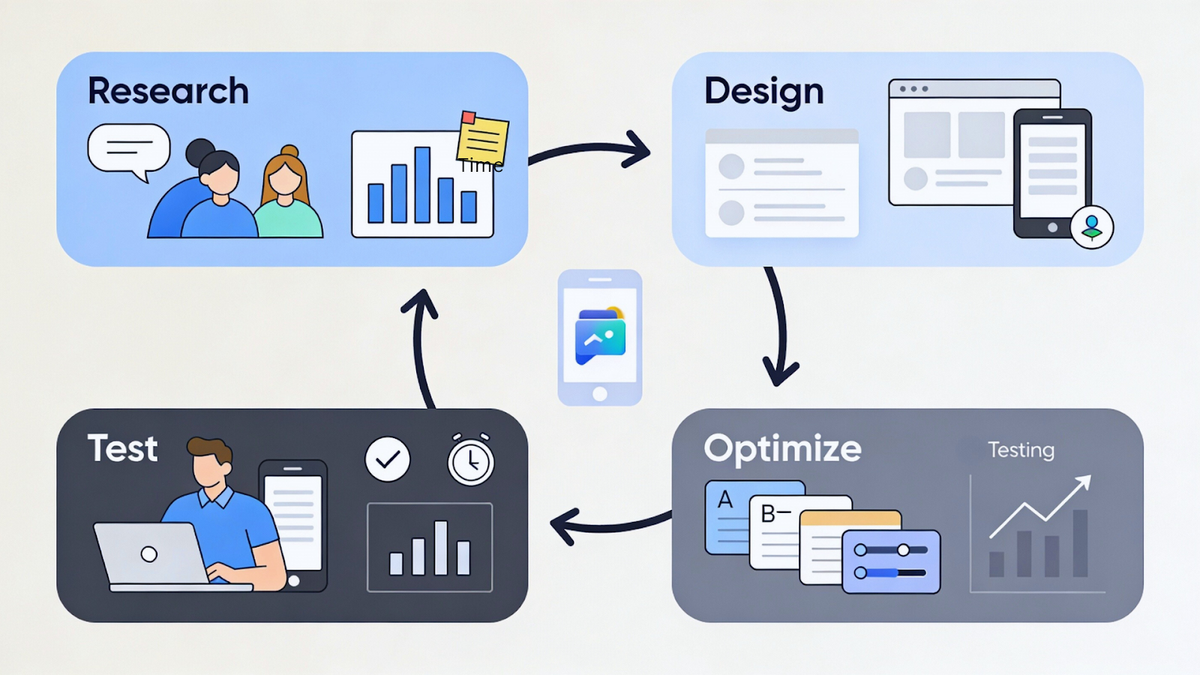
Optimizing user experience in web design requires methodical attention to multiple interconnected elements. By following these ten steps, prioritizing mobile-first design, optimizing page speed, implementing accessibility standards, conducting thorough user research, creating intuitive navigation, leveraging visual hierarchy and white space, designing compelling CTAs, refining content strategy, implementing design systems, and continuously testing with AI tools, you build websites that not only meet but exceed user expectations in 2026.
Remember that every optimization decision should trace back to actual user needs discovered through research and validated through testing. The websites that succeed don't just implement best practices, they deeply understand their users and continuously adapt to serve them better.
Action Items to Start Today:
- Run a Core Web Vitals audit using Google PageSpeed Insights to identify performance bottlenecks.
- Test your site's color contrast ratios using a WCAG checker to ensure accessibility compliance.
- Conduct usability tests with 5-10 users to uncover navigation issues and pain points.
- Create or update user personas based on real customer data and interviews.
- Implement mobile-first responsive design if your site doesn't already use it.
- Set up analytics and heatmaps to understand actual user behavior patterns.
- Optimize your most important CTAs through A/B testing different colors, copy, and placements.
- Begin building a component library documenting your most-used UI elements.
By consistently applying these principles and staying current with emerging trends, you'll create website user experiences that drive engagement, conversions, and lasting business success.