
Why visuals are non‑negotiable now
People form an opinion about your site’s visual appeal in roughly the time it takes to blink, so if your layout looks messy or outdated, many users leave before reading a single line of copy. Research summarised by UX and conversion specialists shows that simple, familiar layouts are rated as more beautiful and trustworthy in those first milliseconds as little as 50ms, according to UX research.
On the content side, multiple studies and surveys report that articles with frequent, relevant images get up to 94% more views and significantly more shares than text-only content, and that marketers now rely heavily on charts, data visualizations, and original graphics in their day‑to‑day work. In short, visuals aren’t just decoration anymore; they’re the first “yes or no” filter for whether someone will give your brand a chance.
Quick study snapshot: how visual designing impacts engagement
Here’s a quick look at what the research says about how visual content performs across different channels and contexts. Use this as your baseline. People don’t just enjoy visually appealing design, they tend to engage with them more too.
| Study / Source | Where it focuses | Key takeaway | |
|---|---|---|---|
| Amra & Elma visual content stats | Blog posts, social | Images every 75–100 words can roughly double social shares. | |
| Venngage visual content survey | Content marketing | Over half of marketers use charts/data viz most; originals beat stock. | |
| 99firms style aggregations | General marketing | Visuals dominate marketing ; many add visuals to all blog posts. | |
| CXL / academic UX research | Website first impressions | Users form design opinions in 50 ms; simple layouts rate higher. |
Use this as your mental model, visuals are the gatekeeper for attention, not an afterthought you bolt on at the end.
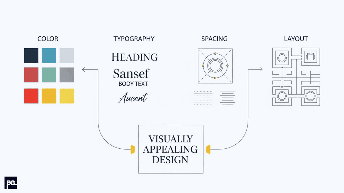
Tip 1: Start with a clear visual identity
Before you worry about design tricks, you need a solid base: your visual identity.In practice, that means deciding how your brand should look and feel so every graphic feels connected and recognizably yours.
At minimum, I always ask clients to define four things before we design anything:
- One primary brand color, plus 1–2 accent colors and one neutral (like white, gray, or black). Most strong brand palettes use no more than 3–5 colors total.
- One font for headings and one for body text (or a single family with multiple weights).
- A clear image style (e.g., minimal icons, clean product photos, simple 3D, flat illustrations).
- A tone direction (playful, premium, minimal, bold, or technical).
Once that visual direction is set, every social graphic, blog header, and landing page should follow it; otherwise, the whole thing starts to feel random. When we build visual identity systems at BrainGig, our UI/UX & brand design work focuses on usable and conversion‑driven visuals, not just fancy design showcase pieces.
Tip 2: Use color to guide emotion and attention
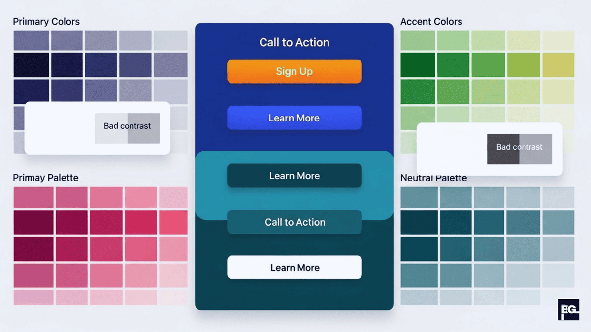
Color is one of the first things people notice, and it shapes both the mood of your design and where the eye goes first.Instead of using color just to decorate, use it to highlight, organize, and direct attention.
Here’s how I usually apply color with clients:
- Keep a dominant brand color for CTAs, key highlights, and important icons.
- Ensure strong contrast between text and background for readability, especially on mobile. The WCAG accessibility standard recommends a minimum contrast ratio of 4.5:1 for normal body text.
- Use warmer colors (like orange or red) to create urgency or emphasize offers, and cooler colors (like blue or teal) to convey trust, calm, and professionalism.
Tools like Coolors or Adobe Color can help you build a nice palette, but the real win comes from using a small, consistent set across everything you design.
Tip 3: Let typography do the heavy lifting
Most weak visual designs I review don’t fail because of color, they fail because the typography works against itself.Too many fonts, inconsistent sizes, and poor alignment make even good content feel amateurish.
When I’m cleaning up a brand’s graphics content, I stick to a few simple rules:
- Use one font for headings and one for body text, or one versatile family with different weights.
- Make headlines clearly larger and heavier, subheads slightly smaller, and body copy simple and highly readable.
- Align text deliberately instead of centering everything; left-aligned text is usually easiest to scan for longer paragraphs. As a general rule, a line-height of 1.4–1.6x the font size keeps body copy comfortable to read.
Clean, consistent typography can make your visuals feel more trustworthy before anyone even reads the copy.
Tip 4: Design with hierarchy, spacing, and grids
When people say a design looks professional, they’re often reacting to good hierarchy and thoughtful spacing more than anything flashy. Visual design principles from UX research emphasize hierarchy, balance, contrast, and whitespace as the core ingredients of a strong layout.
With every visual, whether it’s a hero image, infographic, or social tile I ask three questions:
- What is the primary message someone should get in 1–2 seconds?
- What is the secondary information they can read if they stay longer?
- What’s purely decorative and safe to drop if things feel crowded?
Then I use size, placement, and whitespace to match those answers: bigger elements and top-centered spots draw the eye, while space around key elements makes them feel important. Grids help align everything, keep columns straight, and make a design feel coherent instead of “floating.”
Tip 5: Customize your graphics content to each platform
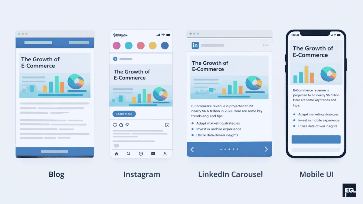
One of the easiest ways to weaken your visuals is to use the exact same design everywhere without adjusting it for the platform. A blog header, an Instagram cover, and a LinkedIn carousel each come with different constraints and opportunities.
Here’s how I usually break it down:
- Blogs: Use custom feature images, diagrams, and charts. A recommended size for blog featured images is 1200 x 628px, which also works well when shared on social media.
- Instagram / TikTok: Prioritize bold, minimal text and strong focal images. Instagram square posts work best at 1080 x 1080px; Stories and Reels use 1080 x 1920px.
- LinkedIn carousels: Give each slide a single, clear idea with strong hierarchy and breathing room around text. LinkedIn carousel slides are typically 1080 x 1080px or 1920 x 1080px (landscape).
- Web UI: Let visuals support usability; on interfaces, design must improve clarity and interaction, not compete with function.
Tip 6: Back your visuals with data and examples
Graphics that look nice but say nothing specific are easy to ignore; visuals that make a clear, evidence-based point are much easier to remember and trust. That’s why I like to turn key stats, comparisons, and outcomes into simple charts or illustrated callouts instead of leaving them buried in paragraphs.
Surveys of marketers show that charts and data visualizations have become one of the most frequently used visual formats, largely because research suggests the human brain processes visuals significantly faster than text, some estimates cite up to 60,000 times faster, and people remember 65% of visual information three days later compared to just 10% of text, making data visualization one of the most high-impact formats in content marketing. In your own content, this can be as simple as a clean bar chart comparing performance or a “before and after” layout that shows how better spacing improves engagement.
Tip 7: Make everything mobile‑friendly and fast
A visually appealing design that only works on desktop is only half done. Most people now see your content on a phone first, which makes any layout or readability issue much more obvious.
When I review graphics for mobile readiness, I check:
- Whether text is comfortably readable without zooming.
- Whether buttons and touch targets meet the recommended minimum size of 44 x 44px and are spaced enough for thumbs.
- Whether key text or faces are getting cropped in common aspect ratios.
- Whether image file sizes are compressed, ideally under 150KB for most web images. Using modern formats like WebP instead of JPEG or PNG can reduce file size by 25–35% with no visible quality loss.
Slow, heavy visuals hurt both UX and SEO, which is why our website development and SEO optimization projects at BrainGig are always built around fast, mobile‑first, visually clear experiences.
Tip 8: Keep visuals accessible, not just pretty
Beautiful visuals that some people can’t read or understand are more than a missed opportunity; they also create accessibility and conversion problems. Visually appealing design principles now treat accessibility as a core requirement alongside aesthetics.
My basic accessibility checklist for graphics includes:
- Strong contrast between text and background, especially for key labels and CTAs. WCAG 2.1 requires a 4.5:1 contrast ratio for normal text and 3:1 for large text (18px+ or 14px+ bold).
- Not relying on color alone to convey meaning; pairing color with icons, labels, or patterns.
- Writing useful alt text for important images on websites so screen readers can describe them.
- Avoiding ultra‑light or overly condensed typefaces for body text.
This ties directly into broader UX work when we improve accessibility, we usually make the design clearer and faster to understand for everyone.
Tip 9: Use the right tools and a simple workflow
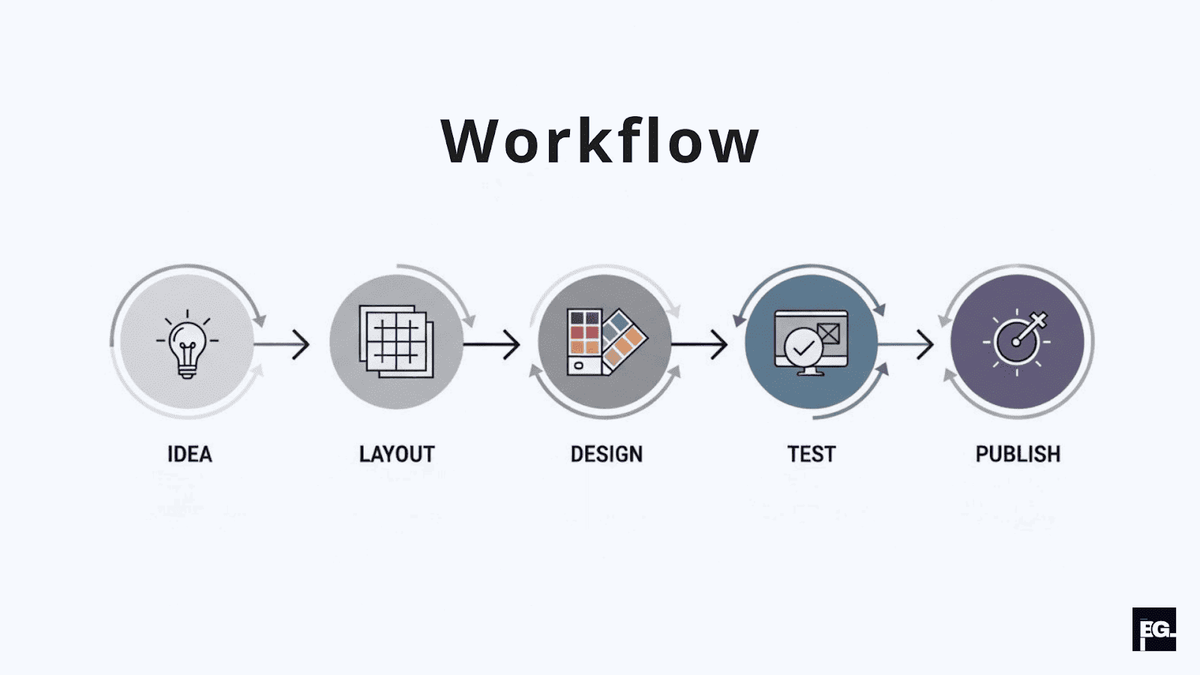
You don’t need to be a senior designer to create strong graphics content, but you do need a repeatable process and a few reliable tools. Without a workflow, every new visual turns into a blank-page struggle instead of a quick, structured task.
A simple workflow I use with teams looks like this:
Define the goal: Write a one‑line outcome for the visual designing (for example, “Explain 3 design tips to small business owners in a single carousel”).
Draft the structure: Sketch rough boxes for title, key point, example, and icon before touching color or effects.
Apply your brand system: Add your defined colors, fonts, logo, and spacing rules so it feels on‑brand.
Add data or examples: Drop in a simple chart, stat, or before and after comparison to ground the visual.
Test on mobile: Export and preview on your phone or via responsive tools to catch any legibility issues.
For tools, I often recommend Figma or Adobe XD for layouts and UI, Canva for quick marketing graphics, Coolors or Adobe Color for palettes, and services like Venngage or Datawrapper for easy charts.
Tip 10: Avoid the classic design mistakes that kill impact
Finally, some of the biggest improvements come from avoiding a few very common visual mistakes I see in almost every audit. These are the issues I coach clients to watch for:
- Too many fonts and colors: Mixing several typefaces and a rainbow of hues destroys cohesion; stick to your small, branded set and reuse it relentlessly.
- No clear focal point: If everything is bold and bright, nothing stands out; ensure one element clearly leads the eye first on every graphic.
- Inconsistent branding across touchpoints: When your website feels one way and your social graphics feel another, people struggle to recognize you; carry your visual identity system across all materials
- Ignoring whitespace and overcrowding: Cramming too many elements, icons, or text blocks into a single graphic makes it harder to read and less trustworthy. Whitespace isn’t wasted space, it’s what gives the important elements room to breathe and stand out.
Final thoughts

Creating strong visual design and graphics content is less about chasing trends and more about getting the basics right: a clear identity, smart use of color and type, platform-specific layouts, and visuals that are built for data, accessibility, and mobile first. As a strategist and team lead of our designer at BrainGig, I’ve seen brands completely change how people perceive them just by treating visuals as a real part of growth instead of an afterthought.
If you’re ready to turn your visuals into a consistent, on‑brand system that actually supports your marketing and sales goals, the BrainGig team can help you connect design, UX, and strategy into one roadmap instead of juggling random assets. Contact us today !